
Have you ever looked at a favorite photo and just knew it would make a stunning piece of stitched art? Thanks to some pretty clever tools, turning a cherished digital memory into a handmade cross-stitch heirloom is easier than you might think. It’s a beautiful blend of traditional craft and modern tech that results in something truly personal.
Turn Your Photos Into Timeless Stitched Art
This guide is your roadmap for turning a personal picture—whether it's a family portrait, a goofy photo of your pet, or a breathtaking vacation shot—into a custom cross-stitch pattern. We’ll walk through the whole process, starting with the single most important step: choosing the perfect image.
From Pixel to Thread
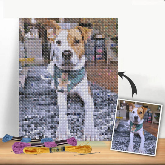
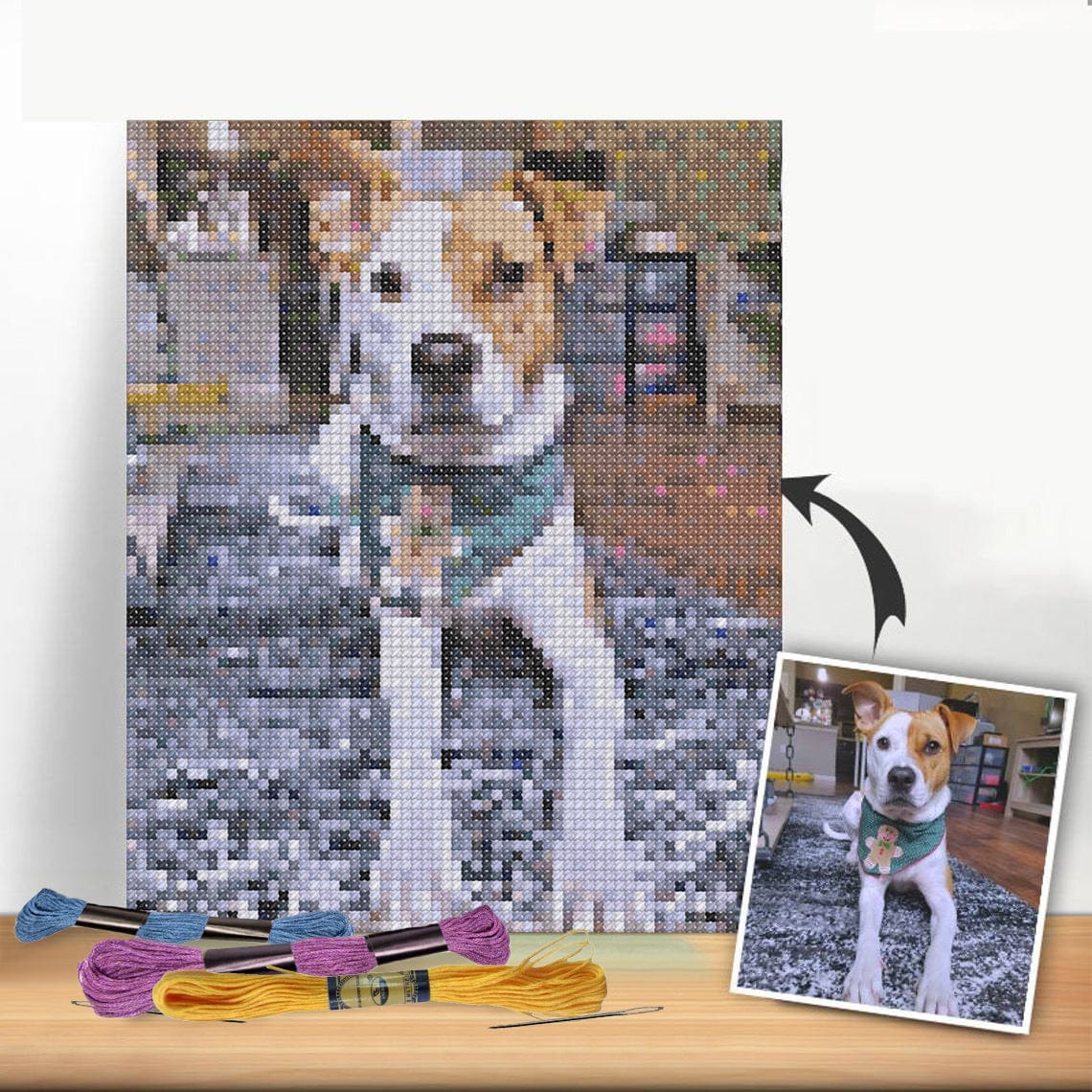
The journey from a digital photo to a stitched masterpiece starts with a good source image. I've learned from experience that a high-resolution portrait with great lighting or a landscape with distinct colors will always produce a better pattern than a busy, low-contrast snapshot. The quality of your starting photo directly impacts the clarity and beauty of your final project.
This push for personalization is a big reason why the craft is seeing such a resurgence. The global cross-stitch market was valued at around USD 0.15 billion in 2024 and is expected to keep growing. It's clear that people are craving unique, DIY crafts and home décor.
Why Bother With a Custom Pattern?
Creating your own pattern is a fantastic way to connect with your memories and make something that is truly one-of-a-kind. It’s your chance to create:
- Gifts That Actually Mean Something: A stitched portrait is an incredibly personal and thoughtful gift for a wedding, anniversary, or milestone birthday.
- Unique Home Décor: Forget generic store-bought art. Display your favorite family moments in a medium you created with your own hands.
- A Relaxing, Rewarding Hobby: There's something incredibly therapeutic about watching a familiar face or a beloved scene come to life one stitch at a time.
By transforming a personal photo, you're not just stitching a picture; you're preserving a moment in thread, creating an heirloom that can be passed down for generations.
Before we get into the nitty-gritty, it helps to see what’s possible. For a little more inspiration, take a look at our guide on making cross stitch patterns from photos. It’s packed with more examples and ideas to get your creativity flowing.
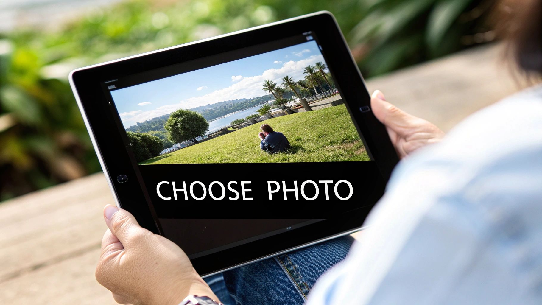
How to Choose and Prepare the Perfect Photo
The secret to a breathtaking cross stitch piece isn't just your stitching—it starts with the photo you choose. A fantastic image translates into a clean, easy-to-follow chart, but a poor one can leave you with a frustrating mess of muddled colors. Think of it like building a house: your photo is the foundation.
Honestly, this initial choice is the most critical decision you'll make in the whole process of creating a cross stitch pattern from a photo. Taking a little time here will save you hours of headaches down the road.
Finding Your Ideal Subject
As you scroll through your camera roll, keep an eye out for photos with a clear, obvious focal point. A portrait of a person or a close-up of a beloved pet will almost always convert better than a busy family reunion shot where all the tiny details get lost in translation.
The photos that work best tend to have a few things in common:
- High Resolution: The more pixels in the original image, the more detail the pattern-making software has to work with. A sharp, crisp photo is your best defense against a blocky-looking final pattern.
- Good Lighting: I always look for photos taken in natural light. Harsh shadows and dark, grainy pictures can hide important details and lead to a funky color palette in your chart.
- Strong Contrast: When your subject stands out clearly from the background, the software has a much easier time defining the edges. This creates a more dynamic and readable pattern.
The goal is to pick a photo that already looks like a work of art. If it's blurry or poorly lit on your phone screen, it will look ten times worse when converted into thread and fabric.
For the absolute best results, start with the highest quality image you can find. If you’re set on a photo that’s a little fuzzy, it’s worth looking into how to fix blurry pictures before you even think about uploading it.
Quick Edits for a Better Pattern
Once you've picked a winner, a few simple tweaks can make a massive difference. You don't need to be a Photoshop pro—the basic editing tools on your phone or computer are more than enough. I usually crop out any distracting background noise and might bump up the contrast just a little to make my subject pop.
These little adjustments are total game-changers. I’m not kidding when I say that spending just five minutes prepping your image can radically improve the quality of your finished chart. If you want to go deeper, we have a complete guide on how to turn a picture into a cross stitch pattern.
Photo Selection Checklist for Best Results
Before you commit, run your chosen image through this quick checklist. It's my go-to method for evaluating whether a photo will make a good cross stitch pattern, and it hasn't failed me yet.
| Attribute | What to Look For | Why It Matters |
|---|---|---|
| Resolution | A clear, sharp image (ideally over 1MB) | Ensures details are captured accurately, avoiding a "pixelated" look. |
| Focus | A single, well-defined subject | Prevents a cluttered or confusing pattern with too many competing elements. |
| Lighting | Even, natural light without deep shadows | Creates a more accurate color palette and reveals subtle details. |
| Background | Simple or uncluttered | Helps your main subject stand out and reduces unnecessary "confetti" stitches. |
Choosing an image that ticks all these boxes gives you the best possible starting point. It sets you up for a pattern that's not only beautiful but also a genuine pleasure to stitch.
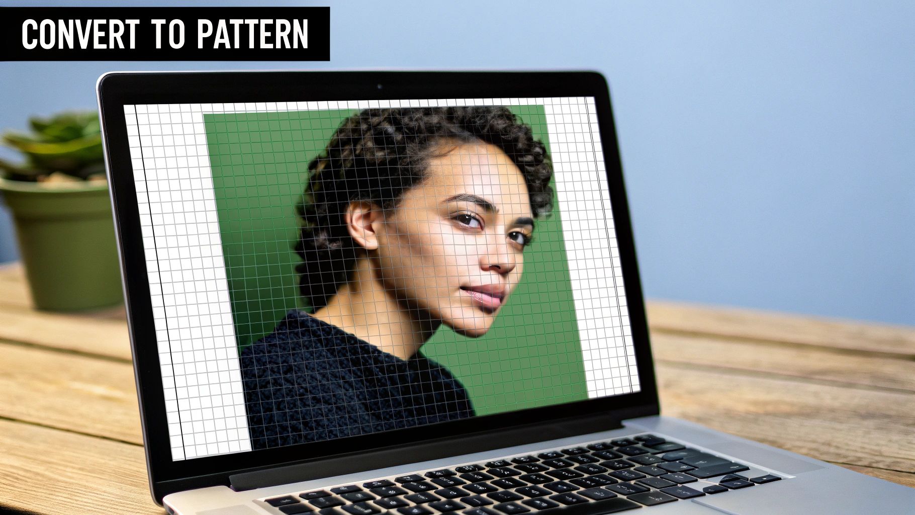
Let's Make Your Pattern with an Online Tool
You’ve prepped your photo, and now it’s time for the really exciting part—turning that digital image into a real, stitchable chart. This is where the magic happens! We'll walk through the process using a great free tool called Pic2Pat, but the same basic ideas will apply to most other pattern generators you might find.
The key here isn’t just to click "upload" and hope for the best. To create a cross stitch pattern from your photo that you'll genuinely love stitching, you need to understand the settings and make thoughtful choices that bring your vision to life.
Getting Started with the Pattern Generator
When you first open a tool like Pic2Pat, the interface is usually pretty straightforward. It's designed to guide you through the most important decisions for your project.
Here’s what the starting screen typically looks like.
Think of this page as your project's command center. This is where you'll upload your image and lay the foundation for your pattern.
Right away, you'll be asked for a few key details. These initial settings are crucial because they control the size, detail, and overall complexity of your finished piece.
- Fabric Count: This is the number of stitches you can make per inch of fabric (often called Aida count). A lower number like 14-count gives you bigger stitches and a larger final design. A higher number, say 18-count, means smaller stitches, which packs in more detail and creates a more compact piece.
- Stitched Size: Here, you decide how big you want the final stitched area to be, either in inches or centimeters. The software takes this, along with your fabric count, and calculates the exact stitch dimensions for your chart.
- Floss Brand: This is a big one! Always pick the brand of thread you plan to buy, which for most of us is DMC. Selecting the right brand ensures the color codes on your printed chart will match the skeins you buy at the store.
I always think of fabric count and final size as a balancing act. For a photo with tons of detail, like a portrait, a higher count fabric (18-count Aida or even higher) really helps capture all those subtle nuances. But for a simpler, more graphic design, a 14-count is often perfect and a lot easier on the eyes during long stitching sessions.
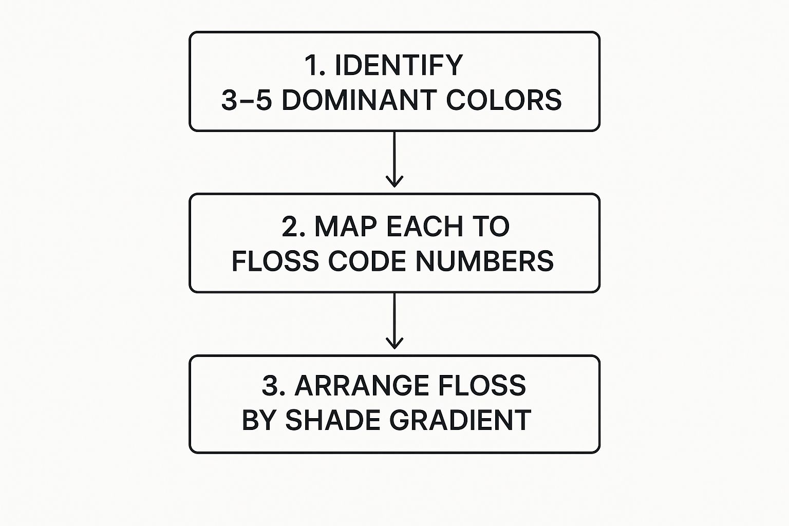
Choosing the Perfect Color Palette
This is probably the most important setting you’ll fiddle with—the number of colors. Your choice here directly affects how realistic your pattern looks and, frankly, how complex it will be to stitch.
More colors can create stunning detail and smooth gradients. The downside? It means more floss to organize and can lead to more "confetti" stitches—those pesky single stitches of one color scattered around, which can slow you down.
There's no magic number of colors that works for every project; it completely depends on your picture. A classic black and white photo might only need 5-10 shades of grey to look incredible. A simple, cartoon-style image could be perfect with just 15-20 colors.
However, for a realistic portrait of a person or a beloved pet, you'll likely need somewhere between 30 and 50 colors to properly capture the subtle shading and skin tones.
My best advice? Play around with it. Generate a preview with 30 colors. Then try it again with 40, and maybe even 50. Look at the PDF previews side-by-side. You'll often discover a sweet spot where adding more colors doesn't add much more detail but definitely adds more complexity. Your goal is to find the lowest number of colors that still captures the soul of your photo.
Giving Your Chart That Professional, Hand-Finished Touch
Getting that automatically generated chart is a fantastic first step, but this is where the real artistry comes into play. You’re about to take a good pattern and turn it into a great one, elevating the project from a simple digital conversion into a truly polished piece of art.
Putting in a little extra time here to refine your chart not only makes the stitching process itself more enjoyable but also guarantees the final result captures the true spirit of your original photograph.
Manually Fine-Tuning The Color Palette
The very first thing I look at is the color palette. Software algorithms can make choices that are technically correct but just feel… off. A common culprit is skin tones in portraits, where the program might assign a slightly grayish or muddy brown that looks flat and lifeless.
Sure, that color might be a perfect pixel-for-pixel match from the photo, but it won't look natural when you stitch it with thread. This is your moment to step in and make an artistic judgment call. Swap that dull floss for a warmer, more vibrant shade from your collection or a DMC color card. Trust your gut and your eye—they often know better than the algorithm.
Dealing With "Confetti" Stitches
Next on the list are those infamous "confetti stitches." This is the term we use for those isolated, single stitches of one color that get scattered across a section, looking like tiny pieces of confetti. They can be a blessing and a curse.
On one hand, they add incredible detail and subtle shading. On the other, they can be a real pain to stitch, involving a lot of starting and stopping. You have to decide if they're worth the effort. In a highly detailed spot, like the glint in an eye or a shadow on a petal, you'll probably want to keep them.
But in larger, flatter areas like a simple background or a solid-colored shirt, they often just make things more complicated than they need to be. Don't hesitate to simplify. If you spot a lone dark blue stitch in a sea of light blue, just change it to match its neighbors. This small tweak will make your stitching experience so much smoother without really changing the final look.
The goal is always to strike a balance between perfect, pixelated detail and practical, enjoyable stitching. A pattern you love creating is just as important as a beautiful finished piece.
Adding the Final Artistic Flourishes
The last part of refining your cross stitch pattern from a photo involves adding texture and definition. This is your chance to manually work in a few specialty stitches that will make key elements of your design pop.
A few of my go-to additions include:
- Backstitching: This is your best friend for creating clean outlines and sharp details. Use this simple line stitch to define the curve of a smile, sharpen the edges of lettering, or trace the delicate veins of a leaf.
- French Knots: Nothing adds texture and dimension quite like these little knots. They are absolutely perfect for pupils in eyes, tiny flower buds, or even simulating sprinkles on a cupcake. If you've never tried them before, our guide on how to tie a French Knot will get you started.
By taking the time to manually edit the chart, you're doing more than just cleaning it up—you're injecting your own creative voice into the design. These final touches are what make the finished piece a true, handcrafted interpretation of your photo, not just a simple copy.
Bringing Your Custom Cross-Stitch to Life
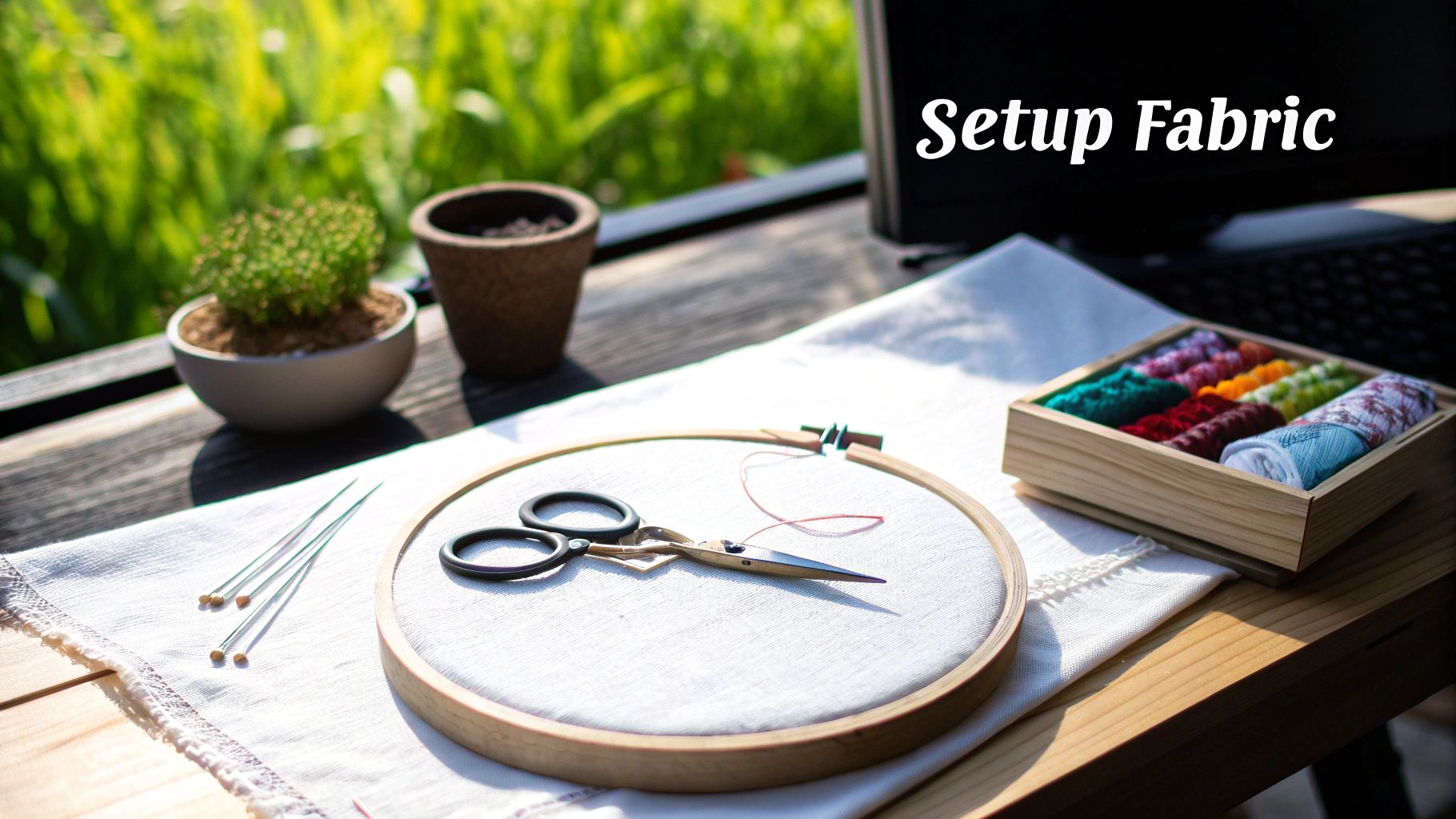
You’ve got your finished chart, and now for the best part: bringing it from the screen into the real world. Before you can make that very first stitch, a little prep work goes a long way. Getting your supplies and workspace sorted out now means you can just sink into the rhythm of stitching later without any interruptions.
The file you downloaded is your complete blueprint. It’s usually a multi-page PDF, and it’s worth taking a minute to get acquainted with it. You'll typically find a preview of the finished piece, a symbol map that tells you which color goes where, and a detailed floss list. That list is gold—it gives you the exact color codes and how much thread you’ll need for each one.
The whole idea of making a cross stitch pattern from photo isn't just a niche hobby; it's part of a huge wave of interest in one-of-a-kind, handmade items. The global embroidery market was valued at USD 1.54 billion in 2024 and is only expected to grow. Projects like this are all about creating something with a real personal story, which is a big deal for a lot of people. You can read more about what's driving this trend in a detailed Business Research Insights report.
Getting Your Chart and Threads in Order
Everyone has their own way of working with a pattern. Some of us are old-school and love having a paper chart to hold and mark up with a highlighter. There's something satisfying about physically crossing off a section you just finished.
Others have gone completely digital. Loading the PDF onto a tablet and using a markup app is a game-changer, especially for zooming in on those really intricate parts of the design.
Next up is the floss. I always recommend winding each color onto a bobbin and writing the DMC number on it. It feels like a chore at the time, but trust me, it saves you from a massive headache later. Arranging the bobbins in the order they appear on your floss list is another little trick that makes finding the next color a breeze.
My Go-To Tip: When a pattern has a bunch of colors that look almost identical (I'm looking at you, shades of grey!), I organize them on a metal ring or in a floss box. It keeps everything neat and prevents the dreaded floss-tangle monster from emerging.
Cutting Your Fabric
The final piece of the puzzle is your fabric. Your pattern will state the final size of the stitched area, but you absolutely need to add extra material around the edges for handling and framing. I've learned this the hard way!
As a rule of thumb, add at least three inches of extra fabric to each side.
It's a simple bit of math:
- Fabric Width = (Design Width) + 6 inches
- Fabric Height = (Design Height) + 6 inches
So, if your pattern finishes at 8x10 inches, you'll want to cut a piece of Aida that’s 14x16 inches. This gives you plenty of room to stretch it in a hoop or q-snap frame and makes framing a clean, professional process.
Once you’ve got all your materials ready, you’re officially set. It's time to thread your needle and start stitching your memory to life.
Your Photo-to-Pattern Questions, Answered
Even with the best tools on your side, taking that first leap into a custom photo pattern can feel a little daunting. A few common questions pop up time and again, so let's get those sorted out right now. Getting these answers straight will help you turn that digital picture into a stitched piece you'll be proud of.
One of the first things people wonder is, "How much detail will I actually see?" The answer really comes down to two things: your fabric count and the final size of your project. A larger piece stitched on a high-count fabric, like 18-count Aida, is going to capture way more nuance than a smaller project on 14-count.
It helps to think of it like the resolution on a TV screen. More stitches per inch are like more pixels—they allow for those subtle color changes and sharper details to really come through.
How Many Colors Do I Really Need?
This is probably the question I hear the most, and honestly, there's no magic number. It’s all about finding that sweet spot between a realistic look and a project that’s actually fun to stitch. Sure, a pattern with 80 colors might look incredible on the screen, but it can also become a nightmare of confetti stitches.
My personal approach is to start in the middle and adjust from there.
- For Portraits: I usually find that 30-50 colors is the sweet spot. That's typically enough to handle tricky skin tones and shading without making you want to pull your hair out.
- For Landscapes: These can be a bit more complex. I'd suggest starting somewhere in the 40-60 color range to get good separation between the sky, water, and greenery.
- For Simple Graphics or Logos: You can often get away with far fewer. Try starting with just 15-25 colors for a clean, bold look.
A great pro-tip is to generate a few different versions of your pattern. You'll quickly see the point where adding more colors doesn't really improve the image but definitely cranks up the difficulty.
What If the Pattern Colors Look… Off?
It happens. The pattern generator spits out a chart, and the colors just don't look right. Maybe the skin tones are a bit grayish, or the beautiful blue sky in your photo now looks dull and muddy. This is because the software is doing a literal pixel-for-thread match, but a glowing screen and physical thread just don't behave the same way.
This is where you, the artist, come in. Don't ever feel like you're stuck with the computer's choices. Grab a real-life DMC color card and find a floss that looks better to your own eye. Sometimes, just swapping out one or two key shades can completely transform the piece from technically correct to truly beautiful.
Trust your gut. If a color in the generated chart feels wrong, it probably is. Making a smart, manual substitution is how you personalize a cross stitch pattern from a photo and elevate it from a project to a piece of art.
Can I Use a Blurry, Low-Quality Photo?
Technically, yes, you can use just about any photo. But—and this is a big but—the quality of your original image is the single most important factor in your final result. A fuzzy, low-resolution photo will give you a fuzzy, indistinct pattern. The software can't create detail that isn't there in the first place.
Always, always start with the clearest, highest-resolution photo you can find. If you're absolutely set on using an old, beloved photo that's a bit blurry, just know what you're getting into. The final piece will have a softer, more impressionistic vibe. If you embrace that style from the get-go, you can create something truly special.
Ready to turn a cherished memory into a work of art? At Cross Stitched, we take the guesswork out of it. Just upload your photo, and we'll send you a complete, all-in-one kit with everything you need. Start creating your personalized masterpiece today.